
Menu
As you build
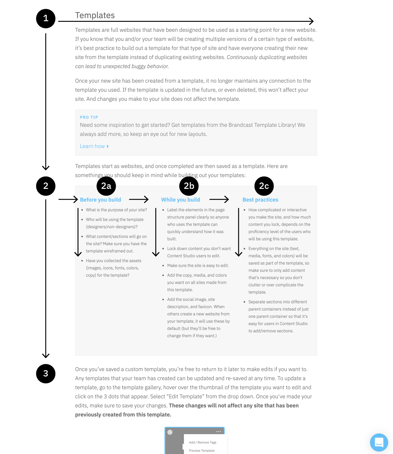
A website is more than just some words and images thrown on a white screen. The colors, content, typography, layout, and imagery all come together to accurately share your message with whoever sees it. There are many things to keep in mind while building your site. This section will cover basic design principles and dive deeper into what exactly makes up a website.
Basic design principles
These are some basic principles to keep in mind while designing.
F pattern
The F- based pattern is the most common way visitors scan text on a website. Eye tracking studies have found that most of what people see is in the top and left area of the screen. The F’ shaped layout mimics our natural pattern of reading in the West (left to right and top to bottom). An effective designed website will work with a readers natural pattern of scanning the page.
Negative space
Negative space describes the areas between different elements on a web page. These spaces deliberately do not display content and do not have to be white. Instead, it can be of any color or can simply include the gradients, patterns or background on the page. Benefits of negative space include improved readability and visual aesthetics, a better balance of elements, and a better overall impression. If someone sees a cluttered, messy site, they might assume that the company shares the same traits.

Grid layout
Grids help to structure your design and keep your content organised. The grid helps to align elements on the page and keep it clean. The grid based layout arranges content into a clean rigid grid structure with columns, sections that line up and feel balanced and impose order and results in an aesthetically pleasing website.
In the TIME Sites Design Studio, you have complete control to organize space, text, and images. Easily add or delete columns, adjust gutter spacing, or nest grids within other grids. Split or stack columns to create responsive layouts in a single click.

Responsiveness
The web is a fluid medium—there is no one set screen size. Someone can look at your website on their phone, tablet, laptop, or desktop monitor. Within each category there are dozens of screen sizes. And on those devices the browser size can be resized as well, leading to even more screen sizes your site can be viewed on. This is why responsiveness should take priority when you build.
TIME Sites makes it easy for you to create responsive layouts. Adjust text sizes or styles, control size, padding, margins, color changes, and even hide or show elements on different screen sizes using our pre-defined breakpoints. To learn more about what kind of changes are responsive in TIME Sites, check out this support article.
Navigation
Navigation is an important feature of your website, as it’s how users will get around your site. You want the navigation to be consistent and clear, so as to reduce any chance a visitor gets lost or confused about where they are and how to get where they want to be. Before you begin building your navigation, answer these questions first:
What is the goal of your navigation?
Do you want users to be able to jump around the site at will, or do you want a more guided experience?
What should go in your navigation?
Do you only need the standard logo and page links? Should there be contact information, a search field, or social icons? Maybe you only need next/previous page buttons?
How do you want your navigation to behave?
Should the navigation always stick to the top, be in a fixed location, or scroll away? Do you want the navigation to overlay the hero image or push it down? Should the navigation change color or size as you start scrolling?
Let’s go over some common kinds of top and page navigation. Footers can also act as navigation and are covered more in-depth in a few sections.
Standard logo and page links top bar
Expandable menus

Mega menu
Persistent left navigation
Breadcrumbs
Previous/Next page buttons
Back to top button


Hero sections
Hero sections are at the top of the page, usually have a background image, big bold text, and a button or two, and is the first thing users see. A good hero section can make or break your site. According to Nielsen Norman Group, users often leave web pages in 10–20 seconds, but pages with a clear value proposition can hold people's attention for much longer. To gain several minutes of user attention, you must clearly communicate your value proposition within 10 seconds.
Things to consider:
The purpose
What do you want a user’s first impression of your page to be?
The copy
The headline and subhead need to be direct, short, and clear. You want a visitor coming to that page to know exactly what to expect, and hopefully make them want to learn more. It doesn’t have to be inspiring, and it should be a statement rather than a question. Headlines can be around 3-7 words, and if you need more than that, then add a subhead to elaborate.
The image
The hero image is critical for the success of your page. People process images 60,000 times faster than text. The image you choose should be relevant to the message your page is trying to convey. It can be a product shot, illustration, photography, or even a solid or textured background if your hero is typography based. Whatever you choose, make sure you provide enough contrast and space to make sure any copy you have is legible.
The call to action (CTA)
Many times your hero section will have a CTA. Should there be a button or buttons that direct users to certain sections of the page, or to entirely new pages? Maybe there should be a form in your hero section as well.
Full hero layouts
Short hero layouts
Text hero layouts
Split hero layouts
Typical layouts
When it comes to the body of your site, there’s only a few different ways to organize your content. Styling those options is what gives you endless design possibilities. As you look through these examples, take notice of their similarities. Grids, alternating images and text, clear text hierarchy, and clear divisions between sections are a common thread.
Condensing information
You don’t want to overwhelm your users by having too much content on a page. You can make your site more engaging by including different interactions that show new content when a user clicks or hovers over an element. Here are some common ways you can condense content.
Accordions
Anything can go in the expanding section of an accordion—text, images, videos, galleries, and even additional interactions.
1st line
❮
Lorem ipsum dolor sit amet, consectetur adipiscing elit. Suspendisse ac diam euismod, vestibulum nisi a, vehicula dui. In aliquam nunc quis varius rutrum. Pellentesque id vehicula erat, tempor euismod augue. Nulla convallis varius dui, ac laoreet turpis lobortis sit amet. Nullam pretium rhoncus est, in congue libero dignissim eu. Lorem ipsum dolor sit amet, consectetur adipiscing elit. Nunc sed accumsan erat, id venenatis ex. Praesent semper lacus molestie, maximus quam vel, condimentum nisl. In vitae tellus nisl. Pellentesque vel finibus nibh, sit amet rhoncus nisl. Fusce et imperdiet metus, a volutpat tortor. Integer scelerisque, purus quis vestibulum dictum, lectus nunc molestie ex, quis suscipit magna ligula eu tellus. Quisque ut finibus justo. Nullam arcu ante, gravida in suscipit in, elementum ac felis. Maecenas sit amet erat sit amet ligula varius gravida.
2nd line
❮
Lorem ipsum dolor sit amet, consectetur adipiscing elit. Suspendisse ac diam euismod, vestibulum nisi a, vehicula dui. In aliquam nunc quis varius rutrum. Pellentesque id vehicula erat, tempor euismod augue. Nulla convallis varius dui, ac laoreet turpis lobortis sit amet. Nullam pretium rhoncus est, in congue libero dignissim eu. Lorem ipsum dolor sit amet, consectetur adipiscing elit. Nunc sed accumsan erat, id venenatis ex. Praesent semper lacus molestie, maximus quam vel, condimentum nisl. In vitae tellus nisl. Pellentesque vel finibus nibh, sit amet rhoncus nisl. Fusce et imperdiet metus, a volutpat tortor. Integer scelerisque, purus quis vestibulum dictum, lectus nunc molestie ex, quis suscipit magna ligula eu tellus. Quisque ut finibus justo. Nullam arcu ante, gravida in suscipit in, elementum ac felis. Maecenas sit amet erat sit amet ligula varius gravida.
Click to show more
Very similar in build to an accordion, just in a more visual layout
Quisque porttitor
❮
Nullam sit amet sem et eros lacinia dictum. Pellentesque faucibus, ex aliquam rhoncus facilisis, metus tellus iaculis libero, in consequat tellus risus quis felis.
Mauris eget dapibus iaculis
❮
Nullam sit amet sem et eros lacinia dictum. Pellentesque faucibus, ex aliquam rhoncus facilisis, metus tellus iaculis libero, in consequat tellus risus quis felis.
Lorem lectus sagittis leo
❮
Nullam sit amet sem et eros lacinia dictum. Pellentesque faucibus, ex aliquam rhoncus facilisis, metus tellus iaculis libero, in consequat tellus risus quis felis.
Pop-ups
Lorem ipsum dolor sit amet, consectetur adipiscing elit. Quisque porttitor, mauris eget dapibus iaculis, lorem lectus sagittis leo, eget vulputate dui quam id enim. Nulla vitae interdum est. Praesent consequat convallis lacinia. Proin dignissim tellus massa, eget interdum neque fermentum id. Cras efficitur efficitur imperdiet. Nullam sit amet sem et eros lacinia dictum. Pellentesque faucibus, ex aliquam rhoncus facilisis, metus tellus iaculis libero, in consequat tellus risus quis felis.
Mauris eget dapibus iaculis
Nullam sit amet sem et eros lacinia dictum. Pellentesque faucibus, ex aliquam rhoncus facilisis, metus tellus iaculis libero, in consequat tellus risus quis felis.
Read more ▸
Carousels
Mauris eget dapibus iaculis
Nullam sit amet sem et eros lacinia dictum. Pellentesque faucibus, ex aliquam rhoncus facilisis, metus tellus iaculis libero, in consequat tellus risus quis felis.
Pellentesque faucibus
Nullam sit amet sem et eros lacinia dictum. Pellentesque faucibus, ex aliquam rhoncus facilisis, metus tellus iaculis libero, in consequat tellus risus quis felis. Pellentesque faucibus, ex aliquam rhoncus facilisis.
Mauris eget iaculis
Nullam sit amet sem et eros lacinia dictum. Pellentesque faucibus, ex aliquam rhoncus facilisis, metus tellus iaculis libero, in consequat tellus risus quis felis. Nullam sit amet sem et eros lacinia dictum.
Flip cards
Quisque porttitor, mauris eget dapibus iaculis.
Quisque porttitor, mauris eget dapibus iaculis, lorem lectus sagittis leo, eget vulputate dui quam id enim. Nulla vitae interdum est. Praesent consequat convallis lacinia.
Quisque porttitor, mauris eget dapibus iaculis.
Quisque porttitor, mauris eget dapibus iaculis, lorem lectus sagittis leo, eget vulputate dui quam id enim. Nulla vitae interdum est. Praesent consequat convallis lacinia.
Quisque porttitor, mauris eget dapibus iaculis.
Quisque porttitor, mauris eget dapibus iaculis, lorem lectus sagittis leo, eget vulputate dui quam id enim. Nulla vitae interdum est. Praesent consequat convallis lacinia.
Text shows on hover
Quisque
Quisque porttitor, mauris eget dapibus iaculis, lorem lectus sagittis leo, eget vulputate dui quam id enim. Nulla vitae interdum est. Praesent consequat convallis lacinia.
Quisque
Quisque porttitor, mauris eget dapibus iaculis, lorem lectus sagittis leo, eget vulputate dui quam id enim. Nulla vitae interdum est. Praesent consequat convallis lacinia.
Quisque
Quisque porttitor, mauris eget dapibus iaculis, lorem lectus sagittis leo, eget vulputate dui quam id enim. Nulla vitae interdum est. Praesent consequat convallis lacinia.
Want these interactions on your site? Add them from the TIME Sites Block Library! We always add more, so keep an eye out for new layouts, interactions, and more.
Footers
At the bottom of almost every website there's a footer. Footers can vary widely, from holding just a line of text to a full menu of all pages on your site, contact info, social icons, and more. When building out your site, ask yourself what content should go in the footer?
- Contact information
- Location (text or map embed)
- Links to other pages
- Logos
- Social links
- Copyright information
- Any other information?
Let’s go over some common kinds of footers.
Simple footer
Mega menu footer
Checking responsiveness
Responsiveness is a vital part your website’s success. According to Statista “mobile accounts for approximately half of web traffic worldwide. In the third quarter of 2020, mobile devices (excluding tablets) generated 50.81 percent of global website traffic, consistently hovering around the 50 percent mark since the beginning of 2017.”
TIME Sites makes creating a mobile-friendly responsive site a breeze with 3 built in breakpoints, allowing you to style your site for four common device modes: Desktop, Tablet Landscape, Tablet Portrait, and Mobile. In each device mode change adjust text sizes or styles, control size, padding, margins, color changes, or hide or show elements. These style changes will only affect the device mode they were set on and smaller. To learn more about what kind of changes are responsive in TIME Sites, check out this support article.
While TIME Sites gives you a good idea of what your site will look like and how it will behave on different devices, it’s always best practice to check the live site on different browsers and devices as you build. The easiest way is to preview your live site in Chrome, right click in your browser and select "Inspect" from the options in the menu that pops up. You can either use the device toolbar to preview your site in different device modes or resize your browser to see how your site reponds.